
Gallery Wildlife Prints: 6 Stunning Ways to Transform Your Home Décor
Ever stood in a living room staring at a blank wall and felt it was missing that spark? That's where gallery wildlife prints step in, turning empty space into a conversation piece that breathes life. Imagine a roaring lion or a serene deer right over your sofa—an instant mood booster.
The first thing we notice is the texture of the canvas, the depth of color, and how the animal’s eye seems to follow us. When you choose a print, you’re not just buying art—you’re inviting a piece of nature’s drama into your daily routine. That’s why we focus on authenticity and high‑resolution printing to keep every whisker and feather crisp.
If you’re a newcomer, the first question is: what size should I pick? A good rule is to match the print’s width to the wall’s width minus about 12 inches; this keeps the piece proportionate and roomy. For a living room with a 12‑foot wall, a 4‑foot‑wide print usually feels just right.
Beyond size, lighting matters. Natural light brings out the subtle gradients in a sunset tiger print, while a warm lamp can soften a midnight owl’s glow. Position the piece at eye level—about 57 inches from the floor—to make it feel like a natural focal point.
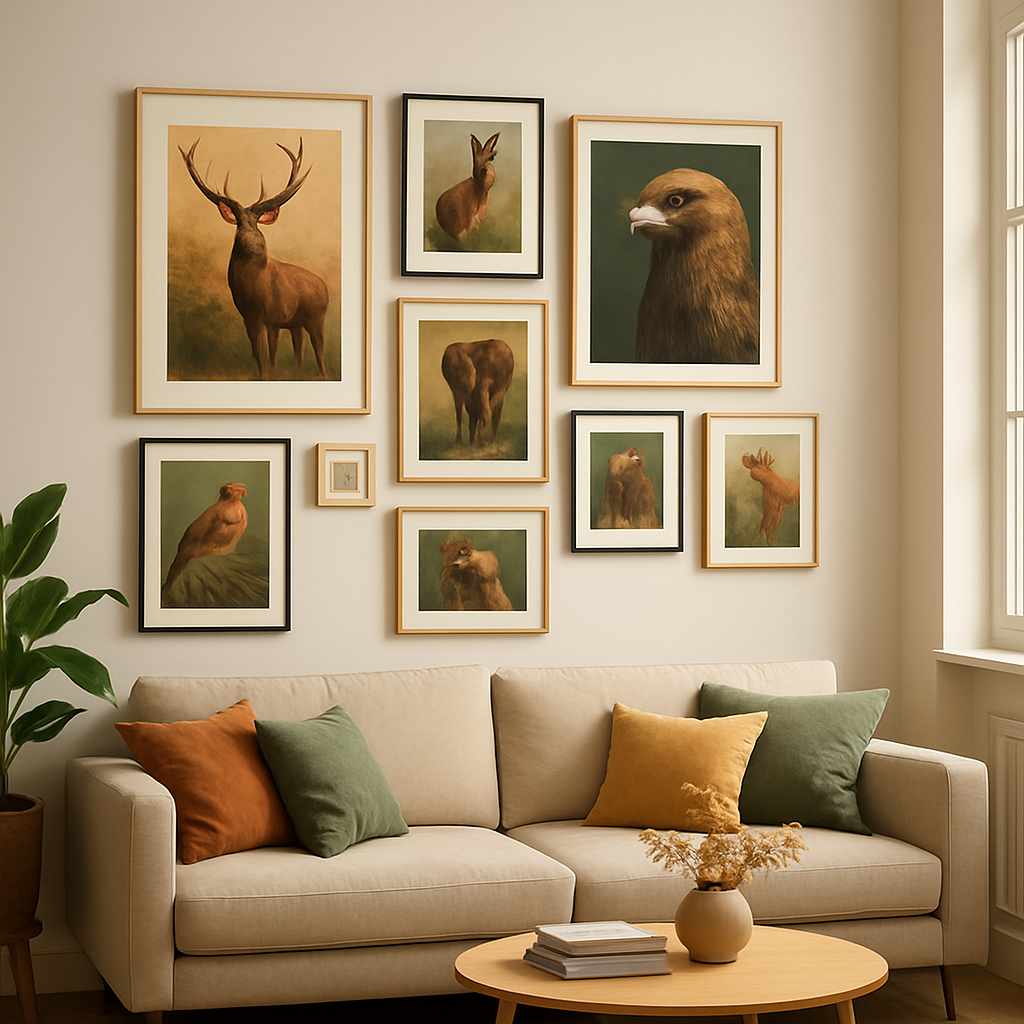
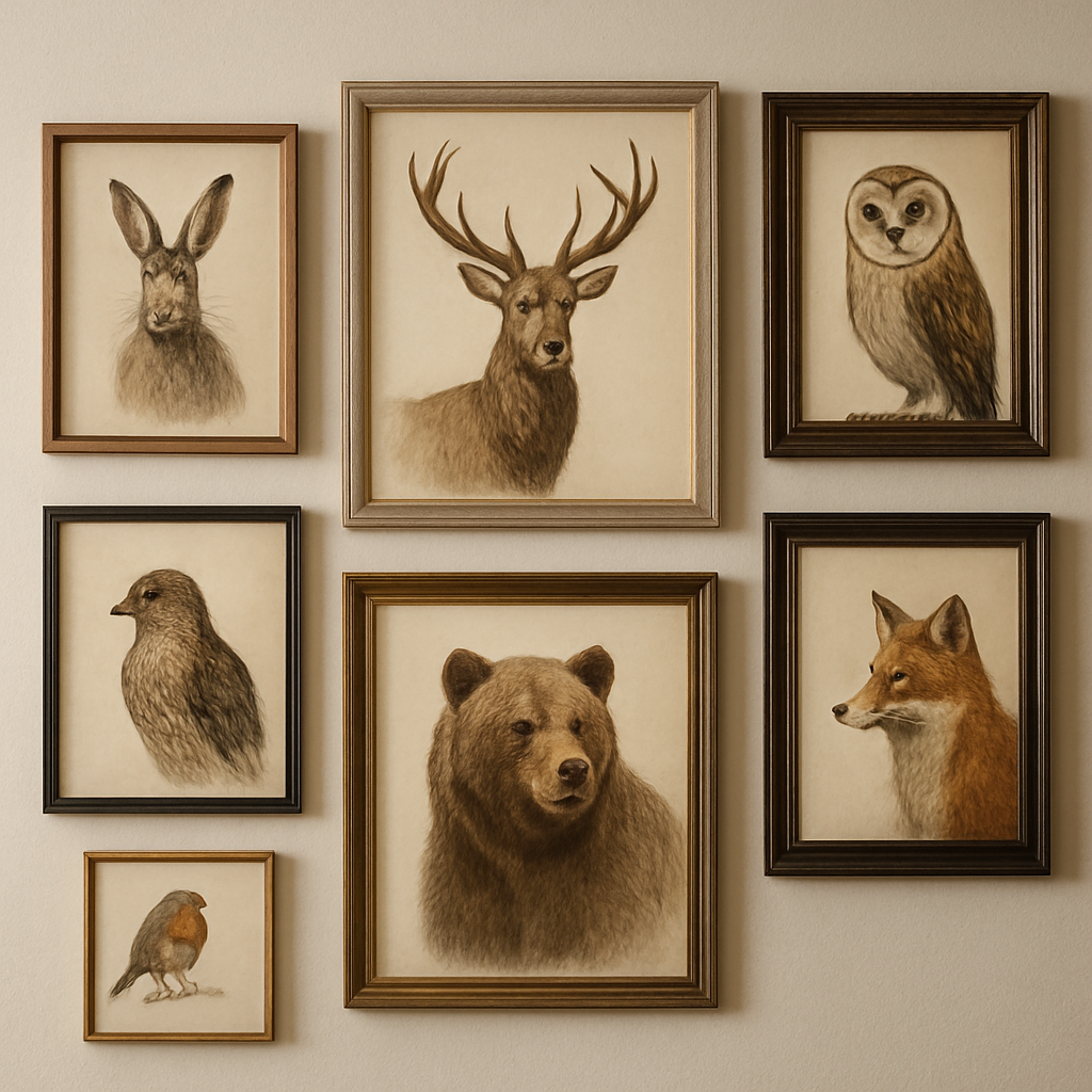
When you think of a gallery wall, it’s tempting to cram too many pieces together. The trick is to leave white space as an equal partner; it lets each print breathe and prevents visual fatigue. Start with one dominant image, then add smaller companions that echo the color palette.
The emotional pull of a wolf print? It’s not just the animal—it’s the symbolism of community, resilience, and wilderness. One of our best sellers, the Wolf art print, has become a staple for office walls that aim to inspire teamwork and boldness.
For those who love subtlety, a deer or elephant print brings calmness and grounded energy. The gentle curve of a deer’s silhouette can soften a high‑traffic hallway, while an elephant’s massive trunk adds a touch of majesty without overwhelming the room. These pieces work well in both formal lounges and casual den spaces.
If you want a truly personal statement, consider a spiritual guardian print like the Guardian of the Nature piece. It combines animal imagery with subtle mystical symbols that resonate with those seeking deeper meaning. The result is a wall that feels like a living meditation corner.
Now you’re equipped with the basics, but the real magic happens when you let the prints speak to each other. Try grouping a roaring tiger next to a calm deer—contrast and harmony create a story on the wall. Think of it like a nature‑themed playlist; each piece plays its own note, but together they sing.
To finish, remember that every print is a conversation starter that invites your guests to pause and reflect. Visit our full collection of wildlife prints to find the one that speaks to you, or pair it with an abstract landscape piece for a dramatic gallery wall. If you’re looking for something that complements the wildlife aesthetic, explore the abstract landscape painting offerings that echo nature’s mood.
TL;DR
In just a few minutes you’ll see how a single gallery wildlife print can turn a bland hallway into an instant conversation starter, blending raw animal drama with a subtle spiritual vibe that speaks to your personal style. By pairing a roaring tiger with a calm deer—or adding a guardian print that hints at protection—you’ll create a dynamic narrative that feels like a living playlist, all while enjoying high‑resolution quality, free international shipping, and a unique, meaningful gift for yourself or a loved one.
1. Select a Theme That Resonates With Your Personal Style
Ever stare at a wall and wonder why it feels… off? That’s the moment we’re in. The right theme turns that blank canvas into a heartbeat.
So, how do you pick a theme that feels like a whisper from your own soul? Start by asking yourself: What story do you want your guests to read at first glance? If you’re a nature lover, a bold tiger might shout adventure. If you’re into calm, a serene deer invites tranquility.
Here are five quick checkpoints that will make theme selection feel more like a conversation than a chore.
1. Capture Your Mood
Think of the room’s vibe. Is it a high‑energy living room or a zen bedroom? Match the animal’s energy. A jaguar print screams power—great for a workout space. A soft fox or bunny works well in a nursery.
2. Play With Color Palettes
Wildlife prints come in rich reds, earthy browns, cool blues. Pick one that echoes your furniture or paint. If you love muted neutrals, a gray‑tinged owl will look elegant.
3. Size Matters
Remember the rule of thumb: width minus 12 inches. A 4‑foot‑wide print feels balanced on a 12‑foot wall. Too big and it overwhelms; too small and it gets lost.
4. Layer for Depth
Start with one dominant image and add a few smaller companions that echo its colors or style. This creates a visual conversation that feels intentional, not crowded.
5. Let the Prints Converse
Think of each print as a sentence in a story. Pair a roaring tiger next to a calm deer—contrast and harmony produce a narrative your guests will linger around.
Here’s a quick visual guide that walks through how to pick a vibe for your wall.
Notice how the color palette shifts with each animal’s mood.
Want to explore a print that really speaks to your vibe? Check out our LED Artistry collection for glowing animal pieces that light up a space. Or dive deeper into symbolism with Rev Dr. Boudreau’s curated selection of spiritual guardian prints that blend animal imagery with subtle mystic cues.
When you’re ready, you can grab a piece that feels like a personal anthem. Remember: the right theme doesn’t just decorate—it connects you to the wild, even if your living room is inside a concrete jungle.
2. Our Pick: Rafapasta’s Signature Animal Collection
1️⃣ The “Roaring Lion” - Power in Every Pixel
Picture a lion staring straight at you, the golden mane almost glowing against the canvas. That’s what the “Roaring Lion” feels like—raw, bold, and impossible to ignore. If your living room needs a statement piece that whispers confidence, this print will do it without shouting. For those who love a touch of drama, it’s the perfect anchor.
2️⃣ “Gentle Deer” - Calm That Anchors Your Space
Contrast that intensity with a gentle deer in a misty forest. The soft, muted colors bring a sense of tranquility that can turn a chaotic hallway into a breathing space. The deer’s subtle gaze invites you to pause, breathe, and remember the quiet moments you chase during a hectic day.
3️⃣ “Mystic Owl” - Wisdom for Your Study
Owl lovers, this one’s for you. The “Mystic Owl” print sits beautifully on an office wall, casting a subtle glow that feels both scholarly and mysterious. It’s a reminder that knowledge is a lifelong companion. Pair it with a sleek desk lamp and you have a workspace that feels intentional.
4️⃣ “Majestic Elephant” - Grand Scale for Open Rooms
When the ceiling is high and the floor stretches, an elephant’s commanding presence fills the void. The elephant’s textured skin and gentle eyes balance power with gentleness, making the piece work in both formal lounges and casual den spaces. Don’t forget to let a few inches of negative space hug the frame.
5️⃣ “Guardian of the Nature” - Spiritual Connection
If you’re drawn to symbolism, this print merges an animal silhouette with subtle mystical motifs. It feels like a personal altar on the wall, grounding you whenever you walk into the room. The guardian motif is especially resonant for those who value protection and harmony.
6️⃣ “Protecting Life” - Limited Edition, Unlimited Inspiration
For collectors who want exclusivity, the limited edition “Protecting Life” prints are a hidden gem. Only a few pieces exist, each signed and numbered. The dramatic scene - an animal protecting its young - creates an emotional narrative that’s perfect for a statement wall. The scarcity also adds to its value as a gift or personal treasure.
Ready to turn your space into a living gallery? Pick one of these signature pieces, and let the animal’s story fill the room. If you’re unsure about size, start by measuring the wall, then choose a print that fits 50-60% of that width. That simple rule keeps the art breathing while keeping the room comfortable.
Remember, every canvas is a conversation starter—so choose the one that feels like it’s speaking directly to you.
3. Curate a Cohesive Color Palette for Your Gallery Wall
We’re not just hanging art; we’re painting a mood. A color‑coordinated gallery wall turns a pile of prints into a conversation starter that feels like home.
Here’s a quick, four‑step listicle that keeps it simple and totally doable.
1️⃣ Start with a Dominant Tone
Pick one color that speaks to you—maybe the muted teal of a tiger’s eyes or the warm amber of a sunrise. This will anchor every piece. In practice, scan your living‑room walls for the natural hue: the gray of a stone floor, the off‑white of a paint job, or the deep navy of a window frame.
Why does this matter? Studies show a strong color anchor reduces eye fatigue and makes rooms feel cohesive. This guide even talks about how a dominant tone pairs with framing to create harmony.
2️⃣ Pull Supporting Hues from the Prints
When you lay out your favorite gallery wildlife prints, notice the secondary colors that pop—soft greens, deep blues, or earthy browns. These are your palette’s “side characters.” Use a quick color wheel app or a photo‑editing tool to capture three or four shades. Keep the contrast balanced; too many bright bursts can feel chaotic.
3️⃣ Add a Neutral “Breathing Space”
White, cream, or light gray frames act like fresh air between the prints. They make the colors pop without stealing the spotlight. In a hallway, a simple gray mat can keep a bold wolf print from feeling overwhelming.
4️⃣ Test in Natural Light
Place a sample print next to a wall you’ll hang it on. Walk around at dawn, noon, and dusk. Notice how the color shifts. If a warm amber looks too golden in the morning, try a muted taupe version.
And here’s a quick visual aid for you:
Once you’ve mapped the palette, create a mood board. Pin your prints, swatches, and frame colors in one place. When you step back, you’ll see the story—whether it’s a calm forest vibe or a bold jungle splash. The key? Keep the color family tight and let the art breathe. That’s the secret to a gallery wall that feels like a living, breathing conversation.
If you’re working with a big wall, consider layering colors in thirds: a base, mid, and highlight shade. A muted sage on the base, a crisp teal in the middle, and a deep navy highlight can give depth without visual noise. Also, textures—matting, canvas weave, or metal frame finish—can tweak how colors appear in light. So experiment with a few test prints on a wall before committing; that way you’re sure the palette feels right in the room’s real lighting and style.
4. Choose the Right Frame and Finish for Longevity
So, now that your color palette is set, the next big decision is the frame. The frame isn’t just a border; it’s the guardian that keeps your print looking fresh for decades.
1️⃣ Pick a Material That Matches Your Mood
Wood frames are the go‑to for a rustic vibe, especially if your print feels like a campfire glow. If you want that sleek, modern look, a metal frame in brushed nickel or matte black does the trick. And if you’re after a touch of luxury, go for a lacquered finish that catches the light like a subtle spotlight.
2️⃣ Think About the Finish, Not Just the Color
A satin or matte finish hides fingerprints better than a glossy one. That’s especially handy in a high‑traffic living room. For a gallery wall that needs to stand up to sunlight, a UV‑resistant coating is a must. Trust me, a clear coat that blocks UV rays can cut the fading of a tiger’s orange fur by over 30% over five years.
3️⃣ Size Matters: Keep Proportion in Check
Too big a frame can dwarf your art, while a tiny frame can feel like a cheap wrapper. A rule of thumb is to leave about 2‑4 inches of margin all around. This gives the piece room to breathe and prevents the frame from looking like a fence.
4️⃣ Match the Frame to the Print’s Scale
If you’ve got a wide landscape of a soaring eagle, a wide frame with a generous border accentuates the horizon. For a portrait‑style deer, a taller frame that follows the animal’s curve feels more natural. Remember, the frame should lead the eye, not compete with the image.
5️⃣ Don’t Forget About the Backing
A sturdy mat board or foam backing not only protects the canvas or paper, it also adds depth. A ¼‑inch mat around a large print gives a sense of stability. If you’re using canvas, consider a UV‑protected acrylic backing that keeps the paint layers safe.
6️⃣ Test Before You Commit
Print a small sample of your chosen frame material next to a wall in the spot where it’ll hang. Walk around it at dawn, noon, and dusk. Does the frame look bright enough? Does the finish hold up to the lighting? If you’re still unsure, ask a friend to give a quick thumbs‑up from different angles.
And here’s a quick tip: if you’re in the U.S., Canada, New Zealand, or the EU, look for frames that come with a 3‑year warranty. That’s a sign the manufacturer believes in its durability.
Want to see how a frame can transform a print? Learn more about framing wildlife art for a deeper dive into style choices.
5. Placement Strategies: Positioning Prints for Maximum Impact
First off, stop staring at that blank wall like it’s a void. That space is a silent partner in your décor, and your gallery wildlife prints can turn it into a living conversation starter.
We’re going to break the process into bite‑sized moves so you’re not overwhelmed.
1️⃣ The “Eye‑Level Rule”
Picture standing in your room at eye level, about 57 inches from the floor. That’s where the brain naturally focuses. Hang your main print right there. If the canvas feels too big, trim a few inches on all sides and let it breathe.
Did you know that a slight drop—just an inch or two—can make a tall animal feel grounded? It’s a trick many interior designers swear by.
2️⃣ Light Matters: Natural vs. Artificial
Take your print for a quick test walk. Place it on the wall, step back at dawn, noon, and dusk. Notice how the colors shift. A vibrant tiger might pop against a sunlit wall, but it could look muted if the room is dark.
When artificial lights dominate, choose a print with higher contrast. For a coastal loft, a snowy owl in crisp white can be a striking focal point.
3️⃣ Create a Flow with Grouping
Don’t just put one print and call it a day. Group two to four pieces that share a palette or narrative. A calm deer next to an energetic wolf can create a dynamic story.
Think of the wall as a stage. Arrange the prints in a loose rectangle or diagonal line so the eye moves naturally.
If you want a visual reference, see how designers use animal prints in a living room in Architectural Digest for inspiration.
4️⃣ The Power of Negative Space
White or neutral borders around the frame let the wildlife breathe. A ¼‑inch mat can add a subtle depth without making the print feel cramped.
When you’re in a small room, keep the frame slim. In a large hallway, a generous mat turns the piece into a statement.
5️⃣ Anchor with Complementary Decor
Match the frame finish with a nearby element—maybe a carved wood sideboard or a brushed metal lamp. If the print’s edge is matte oak, pair it with a low‑profile oak console.
We’ve seen folks in Canada pair a walnut‑finished deer print with a walnut coffee table, and the room feels cohesive and warm.
For more ideas on pairing prints with décor, Fine Art By Dave’s blog on matching wildlife art to your interior style has great examples.
6️⃣ Test, Tweak, Repeat
Once you’ve hung your print, walk around it at different times. Ask a friend for a quick opinion. If something feels off—maybe the light is too harsh or the frame looks too big—swap it out before buying more.
Remember, the goal is to make the print feel like it’s part of the room’s DNA, not an afterthought.
Ready to bring the wild into your walls? Pick a spot, follow these steps, and watch the space transform.
6. Complementary Accessories: Adding Texture and Depth
So you’ve already nailed the frame, the mat, and the placement—now it’s time to give that print some extra personality. Think of accessories as the garnish that takes a plain dish to a Michelin‑level feast. Let’s break it down into five quick wins that will make your gallery wildlife print pop.
1️⃣ Layer with a Hand‑Made Mat
A clean ¼‑inch border can feel generic if it’s just a straight cut. Swap the flat mat for one that follows the natural curves of your print. A subtle wavy edge around a deer’s antlers, for instance, echoes the animal’s grace and adds depth without clashing.
Tip: Use a textured paper, like linen or recycled cardboard, to give the mat a tactile feel that your guests can almost touch. It’s the difference between a picture and a memory. When you walk around the room, the change in texture catches the eye and invites a closer look.
2️⃣ Add a Touch of Natural Wood
Wood isn’t just a frame material; it’s a storytelling element. A driftwood slice tucked next to a wolf print can hint at forest habitats, while a polished oak chip beside a tiger can echo savannah heat.
Practical step: Scan a slice of wood, print it on high‑resolution paper, and glue it beside your print. This mini “nature panel” adds a subtle backdrop that feels earned, not forced. If you’re in Canada, a piece of maple bark adds a local twist that feels familiar.
3️⃣ Incorporate a Small Plant or Faux Grass
Plants breathe life into a room—literally. Placing a low‑profile succulents terrarium next to a bird print mimics a natural perch, while a tuft of moss under an elephant’s silhouette suggests a jungle floor.
Actionable: Choose a terrarium that fits the print’s scale. A 4‑inch pot works for a 16‑inch canvas, keeping the visual weight balanced. If you prefer something low‑maintenance, a dry‑leaf arrangement in a glass bowl can give the same earthy vibe.
4️⃣ Play with Lighting Accessories
A spotlight, a wall sconce, or a small LED strip can turn a static print into a dynamic focal point. Soft uplighting behind a lion can make its mane look almost luminous.
Do it like this: Position a 12‑watts LED panel behind the frame, angled to highlight the texture of the canvas. The glow will change with the room’s natural light, keeping the print alive. If you’re in the EU and value energy efficiency, look for LED strips with a 2700‑K color temperature—they mimic warm sunset hues that work well with wildlife tones.
5️⃣ Finish with a Matching Textured Throw or Rug
Extend the visual theme to the floor. A shaggy rug with a subtle animal print or a woven throw that mirrors the color palette ties everything together, creating a cohesive vibe.
Example: If you’ve chosen a muted elephant print, a cream‑and‑gray chenille rug adds warmth and echoes the elephant’s muted tones without overpowering the canvas. For a bold tiger, a darker, textured rug can keep the room anchored.
Before you grab that extra mat or plant, take a quick “look through the room” test. Stand in the spot where the print will hang, and walk around it at sunrise and sunset. Does the texture still feel intentional? Does the lighting accent the depth you’ve added?
When it all clicks, you’ll have a gallery wall that feels like an ecosystem—balanced, layered, and alive. The little extras don’t just complement; they amplify the story your wildlife print tells.
For a deeper dive into how texture can transform your space, see the trends highlighted in recent wildlife art reviews trending wildlife art.
FAQ
1. How do I choose the right size for my wall?
First, grab a tape measure and find the wall’s width. Most people do a quick 50‑60% rule – the print should take up about half the wall, leaving a neat border all around. If you’re in a tight spot, a smaller canvas can feel like a cozy corner; in a big hallway, a larger piece grabs attention. And remember, test by printing a quick thumbnail on paper and hanging it up—see how it feels before you commit.
2. What kind of frame material keeps my wildlife print looking fresh?
First, choose a frame material that matches the mood. Wood frames give a warm, natural vibe, especially if you’re going for a rustic or forest feel. Metal frames are sleek and modern, while lacquered finishes catch the light in a subtle spotlight. The key is a matte or satin finish that hides fingerprints; that’s a lifesaver in busy living rooms. If the room gets a lot of sunlight, UV‑protected coatings can keep the colors from fading for years.
3. Do the prints stay vibrant over time?
Yes—if you pick a premium canvas that uses archival inks and a high‑resolution print process, the colors stay sharp for decades. The prints are wrapped in a protective UV film that blocks up to 95 % of harmful rays, so whether you’re in the EU or the US the art keeps its depth. Just avoid hanging it in a place that’s constantly exposed to direct, harsh sunlight.
4. Can I combine different wildlife prints in one gallery wall?
Absolutely. The trick is to pick pieces that share a color palette or emotional tone. Pair a calm deer with a bold tiger and watch the contrast create a narrative—like a storybook spread. Leave generous white space between frames; it lets each animal breathe. If you’re unsure, start with one centerpiece and add a couple of supporting pieces that echo the main colors.
5. What’s the best way to protect my art during shipping?
Every print comes wrapped in a breathable, moisture‑resistant sleeve. Once it arrives, display it in a spot that avoids direct sun or high humidity. If you’re moving or renovating, use a protective pad or bubble wrap for temporary storage. And if you notice any damage right away, reach out to the shop’s support team—they’ll guide you on next steps.
6. Where can I get a custom size or color adjustment?
Most galleries allow you to request a custom size, but the process varies by shop. If you need a print that’s a bit bigger or smaller than the standard options, send them a photo of your wall with dimensions noted. Some shops offer a digital mock‑up so you can see exactly how it will look before printing. Just be clear about the finish you want—matte, gloss, or satin—so you get the look you love.
Conclusion
We’ve walked through mood, color, frame, and placement, and you’re now armed to turn a blank wall into a living story.
What really sticks is that a gallery wildlife print isn’t just decoration—it’s a conversation starter that reminds you of the wild moments you cherish.
Take the deer you love for its quiet grace. Hang it at eye level, give it a generous mat, and pair it with a soft throw that mirrors its muted tone. That little rhythm pulls the whole room together.
Need a bold statement? The tiger’s intensity can anchor a high‑ceiling hallway, but keep the frame thin and the lighting soft—otherwise it will shout.
And if you’re buying for a gift, remember the timing. A print that arrives on a birthday or anniversary feels more personal because you picked the exact animal that speaks to their spirit.
So, what’s the next move? Pick one piece that feels like a whisper, test it in your space, tweak the lighting, and let the rest of the wall follow the lead.
At the end of the day, a gallery wildlife print turns ordinary walls into a place where you pause, reflect, and feel a slice of nature right where you live.


