
Contemporary Wildlife Art Prints: A Practical Guide to Buying & Displaying Stunning Nature Art
Picture this: you’re scrolling through your feed and suddenly a burst of color and motion grabs your eye—a leopard leaping across a canvas, its spots like starlight. That’s not just art; it’s a story, a pulse that can turn a plain wall into a conversation starter.
In 2026, home‑decor trends show that people are gravitating toward pieces that feel alive—wild, unpredictable, and deeply personal. When you bring a contemporary wildlife print into your space, you’re not just filling a square inch; you’re inviting the spirit of the animal to mingle with your daily rhythm. Think of it as adding a silent companion who watches over your morning coffee, your evening read, or your child’s desk.
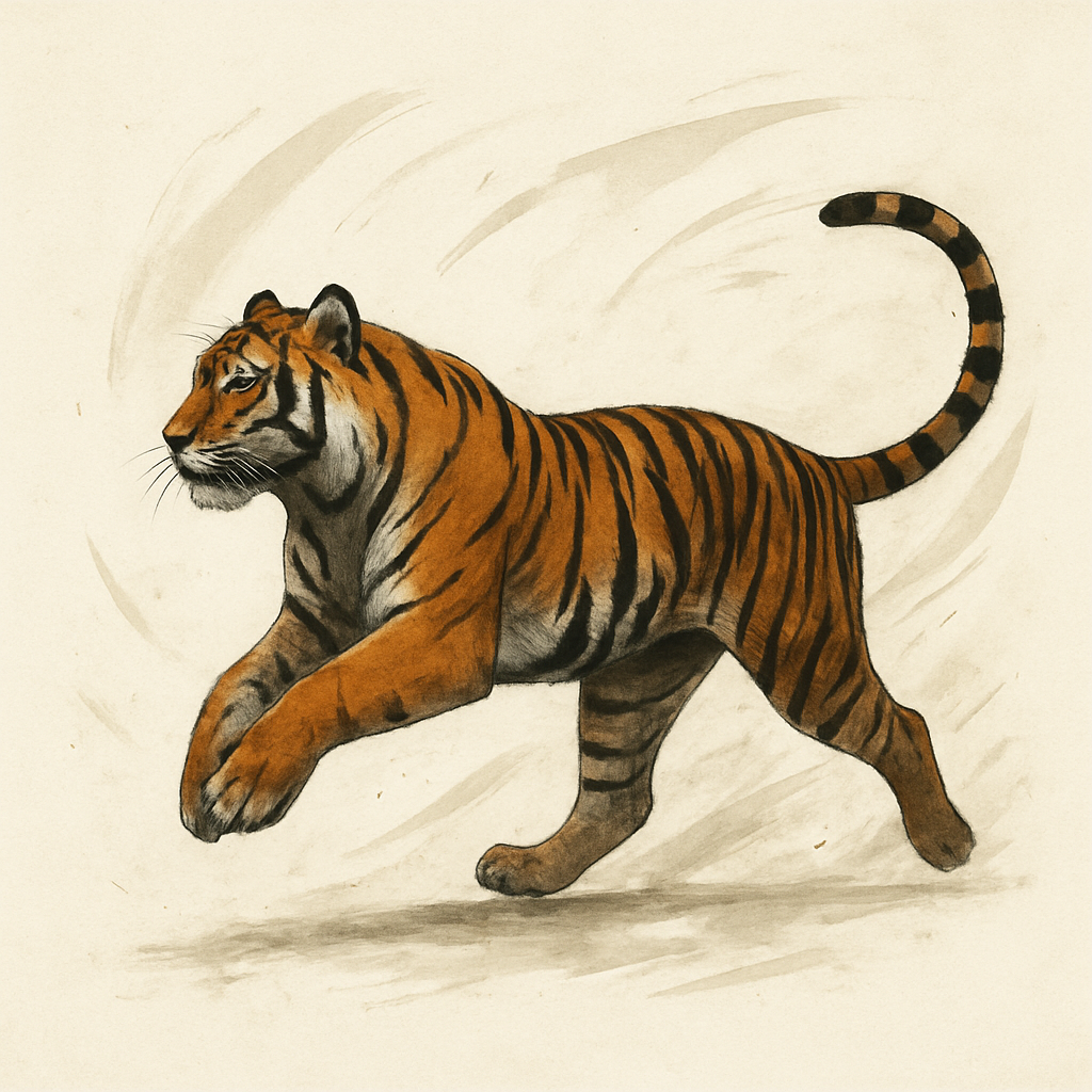
What makes a print truly “contemporary” is its blend of classic subject matter with bold, modern techniques. Vibrant pigments meet crisp digital printing, and the result is a print that looks fresh on a minimalist loft yet feels timeless in a farmhouse kitchen. A great example is the Leopard art print, which balances a sleek, black background with the animal’s dynamic form.
Curating a wildlife collection can be as simple as picking a theme—savanna, forest, marine—and then layering prints in complementary sizes. Start with a focal point: a large, high‑resolution piece that anchors the room. Next, sprinkle medium and small prints around it, using frames in a single color palette to keep the look cohesive. If you’re unsure about scale, measure the wall space first and choose prints that fit 40–60 % of that area; this prevents the room from feeling crowded or empty.
For those who love to mix styles, pairing a bold animal print with a softer abstract landscape can create visual harmony. That’s where our partner, Gratitude Studios, comes in. Their abstract landscape painting offers muted earth tones that echo the natural hues in a leopard print, giving you a gallery wall that feels both lively and serene.
So, if you’re ready to make your walls feel alive, start by choosing a print that speaks to you—whether it’s a roaring lion, a gentle deer, or a daring tiger—and let it become part of your daily narrative.
TL;DR
If you’re hunting for contemporary wildlife art prints that pulse with emotion, this guide shows how to pick pieces that echo your space’s vibe today. By layering focal points, sizing wisely, and mixing textures, you’ll transform any room into a living gallery that feels as alive as the animals themselves.
Step 1: Define the Story Behind Your Wild Art
Before you even pick a print, ask yourself why you’re drawn to that particular animal. Is it the way its eyes seem to follow you around the room? Or maybe it’s the roar in its posture that feels like a quiet reminder of adventure? These feelings are the first clues to the narrative you want your wall to tell.
Think of your space as a living canvas. Your chosen piece should echo the rhythm of your daily life—maybe a bold, jagged silhouette for a high‑energy studio or a calm, flowing form for a tranquil bedroom. When the animal feels like part of the room’s heartbeat, the art becomes more than decoration; it becomes a companion.
Start with a question: What story do you want to whisper every time you walk into the room? Do you want a piece that sparks conversation at dinner parties? Or one that offers a quiet escape in your office? Narrowing the narrative will help you filter options and focus on a print that truly resonates.
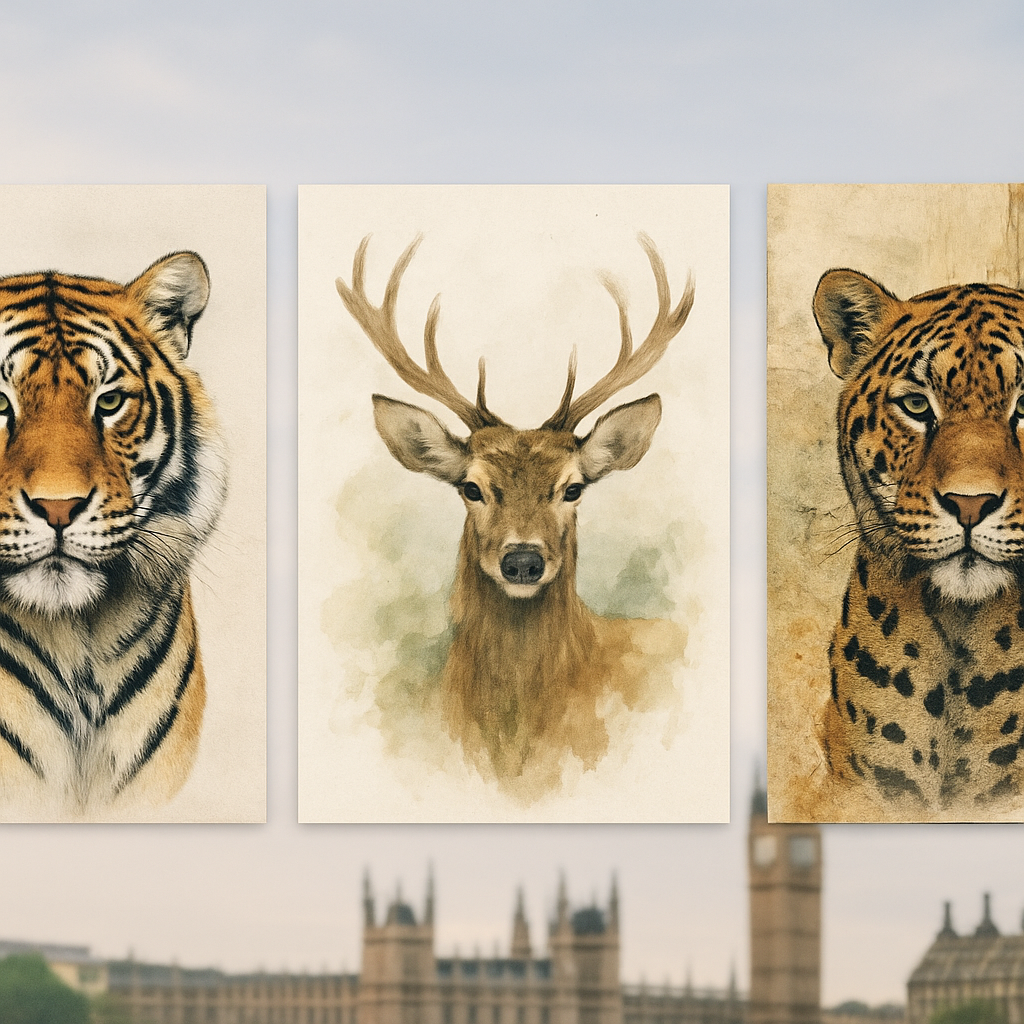
Here’s a quick exercise: grab a notebook and jot down three adjectives that describe the vibe of the room—modern, cozy, energetic, serene. Then, match those adjectives to an animal’s typical energy. A roaring lion for bold, a gentle deer for serene, or a vibrant dolphin for playful. The animal’s essence should sync with the room’s mood.
Now, consider the print’s size and placement. A large, high‑resolution piece can act as a focal point, but only if it feels proportionate. Use a simple rule: the artwork should occupy about 40‑60 % of the wall space you intend to dedicate. This prevents the room from feeling either overwhelmed or empty.
When you’re ready to browse, keep in mind that contemporary wildlife art prints often blend classic subjects with modern techniques—think bold colors and digital crispness that still honor the animal’s natural grace. For example, the Leopard art print from Rafapasta Art Gallery balances a sleek black background with the animal’s dynamic form, making it a perfect conversation starter for a modern loft.
Let’s add a bit of personality: If you’re a nature enthusiast, look for prints that highlight symbolism—like the protective stance of an elephant or the graceful flight of a deer. These details add depth and invite viewers to ponder the animal’s role in the wild.
Remember, the story you’re telling isn’t just about the animal itself; it’s also about what you feel when you look at it. Does the piece bring calm, excitement, or curiosity? Ask yourself that question before making a final decision.
Once you’ve chosen a print, think about framing. A simple, single‑color frame keeps the focus on the artwork and can tie multiple pieces together if you build a gallery wall later on.
And here’s a quick tip: Use a mood board. Pin images of the room, your chosen print, and complementary elements like pillows or rugs. Seeing everything together will confirm whether the narrative feels cohesive.
Do you already have a piece in mind? Great—now let’s explore how that story can evolve as your space grows. The narrative can shift, and that’s part of the art’s magic.
Speaking of evolving narratives, I’ve worked with clients in the USA, Canada, and the European Union who asked how to keep their décor fresh. One strategy is to rotate prints seasonally, pairing a roaring tiger in the spring with a snowy wolf in winter. This keeps the wall alive and gives you a reason to revisit your space.
Feeling inspired? Start by jotting down the story you want to tell, match it with an animal that feels right, and then choose a print that feels like a true conversation partner for your room. That’s the first step toward a living, breathing gallery wall.
Now, let’s see a quick visual guide on how to set up a gallery wall with a focal print.
In the meantime, imagine the animal’s story unfolding on your wall. The right piece will not only enhance your décor but also bring a sense of purpose to the space.
Before you finalize your choice, consider visiting Rev Dr. Boudreau, a well‑known curator of modern natural art, for deeper insights into selecting prints that resonate on a personal level. Also, check out Betti Navarro Rodriguez Aguilera, whose photography often captures the intimate moments of wildlife—her perspective can inspire the narrative you build around your art.
Step 2: Evaluate Print Quality & Materials (and Where to Buy)
So, you’ve picked the animal that feels like your personal mantra, and now it’s time to make sure the print you’ll hang looks as wild as your heart wants it to.
Let’s break it down into bite‑sized steps that you can tackle in a few minutes and still feel confident about the final choice.
First thing’s first: measure the wall. Grab a tape measure, a friend, and a notepad. Measure the height, width, and the area you’re willing to let the artwork own.
Rule of thumb? Your print should cover about two‑thirds of that area. If you’re eye‑leveling a living room wall, think 4–5 feet tall for a standard 8‑by‑10 print.
Ask yourself: Do I want a statement piece that fills the space or a subtle backdrop that plays behind other décor? The answer will steer your material choice.
Orientation matters: Landscape vs Portrait
Many wildlife shots are horizontal because the horizon is the star. A landscape orientation works great on wide walls and in entryways.
If you’re hanging a portrait of an animal that’s close‑up—think a fox’s eyes or a bird’s beak—a vertical layout keeps the focus centered.
When you’re unsure, lay a paper cut‑out on the wall to see how it feels. Sometimes a quick visual test is all you need.
Paper vs Canvas vs Metal: The Material Showdown
Prints can sit on glossy photo paper, textured canvas, or even brushed metal. Each feels different under the light.
Glossy paper gives that high‑contrast pop you see in a gallery, but it can glare in bright rooms. Matte paper keeps the color true without shine.
Canvas adds a tactile, painterly vibe—great for a cozy, farmhouse feel. Metal prints are sleek; they’re almost like a sculpture on a wall.
Ask: Do I want the print to breathe like a painting or to stand out like a modern sculpture? Your answer will tell you whether to go canvas or metal.
Finish matters: Matte, Satin, Gloss, or Lustre?
Even on the same material, the finish changes the mood.
A matte surface softens the image, making colors blend in a subtle way.
Satin offers a gentle sheen—less glare than gloss but more depth than matte.
Gloss finishes scream brightness; they’re ideal for bold, saturated images.
Lustre sits between satin and gloss—think fine art photography with a touch of elegance.
Test a sample if you can. Hold it up in the lighting your room offers. The right finish feels right when you’re in the room at dusk, when the sun fades.
Archival quality: ink and substrate that last.
Every serious print uses archival inks and a neutral pH substrate. That means the colors won’t fade in a year, ten years, or even a century.
Ask the seller for details: Are the inks UV‑protected? Is the paper acid‑free? These little words are a big guarantee for long‑term beauty.
In my experience, prints that brag about “museum‑grade” or “archival giclée” tend to hold their luster longer than mass‑printed ones.
Frame or no frame? Let’s talk mounting.
Some prints come pre‑mounted—ready to hang out of the box. Others come unframed so you can match a custom frame.
Float frames are trendy; they give the image a floating effect.
Gallery‑wrapped frames add a subtle border that frames the story.
If you’re in a modern loft, a metal frame might match the décor.
In a rustic cabin, a simple wood frame keeps the focus on the animal.
Consider the space: a framed print can act like a centerpiece; an unframed print lets the wall breathe.
Where to buy: quick checklist.
1. Verify the seller’s return policy—especially if you’re buying a large statement piece.
2. Check shipping: free international shipping? That’s a game‑changer if you’re overseas.
3. Look for a certificate of authenticity. It’s a small extra that can mean a lot later on.
4. Compare prices across the same size and material. A slight difference can add up if you’re building a collection.
5. Read the product description for details on ink, finish, and paper type. The clearer it is, the less guessing.
Putting it all together: a practical mini‑checklist.
Measure your wall. Decide how much space the print will occupy.
Choose orientation. Landscape for horizons, portrait for close‑ups.
Select material. Canvas for cozy, metal for sleek, paper for vibrant.
Pick a finish. Matte for subtle, gloss for pop, satin for balance.
Confirm archival quality. Look for UV protection and neutral pH.
Decide on framing. Pre‑mounted, float, or gallery wrap.
Verify seller details. Shipping, returns, authenticity.
Doing these steps feels a lot less daunting once you’ve seen them in action.
Now you’re ready to pick a print that not only looks fierce but also stands the test of time.
And remember: the goal isn’t just a pretty picture; it’s a conversation starter that feels like it grew out of the very room it now occupies.
Step 3: Compare Top Contemporary Wildlife Print Styles
We’ve already mapped out the emotional beat of your space. Now it’s time to match that pulse with the right style of print. Think of it like picking a soundtrack: each genre hits a different chord.
First, let’s break the styles into bite‑size buckets so you can see what feels right before you dive deeper.
1. Digital Fine‑Art Prints – High‑resolution images on canvas, paper, or metal. They’re the “gallery‑ready” look that keeps the animal’s detail sharp even from a distance.
2. Hand‑Painted Illustrations – These bring a painter’s brushstroke into the frame. The colors can be vivid or muted, depending on the artist’s intent.
3. Mixed‑Media Collages – A mash‑up of photographic layers, textures, and sometimes even three‑dimensional elements. They feel experimental and bold.
So, what’s the real difference? It’s not just the medium but the mood they convey.
Digital fine‑art prints are perfect when you want crisp realism. Picture a tiger that looks like it could pounce out of the frame. That’s the power of archival inks on a matte paper finish.
Hand‑painted pieces, on the other hand, often lean into emotion. A watercolor deer with soft edges feels like a whispered memory rather than a statement.
Mixed‑media collages tend to shout. Think of a jaguar image layered over a textured canvas background that almost feels like a weathered wall itself.
Now let’s get practical. How do you pick the right one for your wall?
Step 1: Size the space. Measure the wall area and choose a print that occupies about 40‑60% of the wall to keep it from looking crowded or shy.
Step 2: Match the finish. If your room has lots of natural light, a matte finish will reduce glare. In darker rooms, a satin or low‑gloss gives depth without too much shine.
Step 3: Test a mockup. Print a small swatch of the animal on your chosen paper or canvas and hang it up. Let it sit for a day to see how the light hits it.
Do you think your space needs the subtlety of a watercolor deer or the fierce linework of a digital tiger? Ask yourself what conversation you want the piece to spark.
Here’s a quick comparison that captures the essentials:
| Feature | Digital Fine‑Art | Hand‑Painted | Mixed‑Media |
|---|---|---|---|
| Realism vs. Stylized | High realism, sharp detail | Soft, interpretive strokes | Bold, experimental layers |
| Finish Options | Matte, satin, gloss on paper or canvas | Brushstroke texture on canvas | Texture mix—paper, canvas, metal |
| Ideal for | Modern lofts, minimalist walls | Cozy living rooms, artistic studios | Gallery walls, avant‑garde spaces |
When you’re ready to make a decision, remember that the “best” print isn’t always the most expensive. Think about how the artwork will age with your decor, and how it reflects your personal story.
Imagine hanging a large, vibrant canvas of a leopard on the main dining wall. Every time you gather, the animal’s gaze feels like a silent toast to the shared moment. That’s the kind of emotional thread we’re after.
And don’t forget the framing. A simple black metal frame can make a mixed‑media collage pop, while a soft wood frame can soften the edges of a hand‑painted piece.
Once you’ve narrowed it down, run a quick check: Is the print archival? Does the seller ship internationally? Are there free returns? These tiny details keep the stress at bay.
So, what’s the takeaway? Pick a style that mirrors the rhythm of your room, test a sample, and then trust your gut. The right print will feel like it belongs right where it hangs, not like it was an afterthought.
Step 4: How to Display & Care for Your Prints
Choose the Right Spot, Not Just the Wall
It’s easy to pick the biggest empty wall, but the best canvas often hides behind the sofa or below a window. Think of where the light lands most consistently. A quiet corner with indirect light keeps colors true, while a bright spot near a skylight can make a leopard print pop like a sunrise.
When you’re measuring, remember the rule of two‑thirds: a print should cover about 60 % of the wall it occupies. That gives the space breathing room without feeling cramped. If you’re working in a living room with a 12‑foot wall, a 3‑by‑4‑foot canvas works well—big enough to command attention, small enough to stay grounded.
White Space Is Your Best Friend
White space doesn’t mean a blank wall. It’s the intentional breathing room around the artwork. Leave at least a 4‑inch margin on all sides so the print doesn’t feel boxed in. When you add a matching frame, that frame itself can become a subtle white‑space buffer, letting the colors breathe.
Picture this: you hang a 5‑by‑7‑inch deer print above a bookshelf. You leave a 5‑inch border above, below, and on the sides. The surrounding room feels generous, and the deer looks like it belongs in its own little niche.
Match Frame to Mood, Not to the Room
Black metal frames make a bold statement, while natural wood frames soften a delicate watercolor. If you’re showcasing a jaguar that’s all about raw power, a sleek black frame echoes that edge. For a gentle deer, a weathered oak frame adds a touch of earthiness.
Frame choice also protects the print. A float frame keeps the canvas slightly lifted, preventing wall paint from touching the surface. Gallery wrap frames hide the edges, giving a seamless look that’s perfect for modern spaces.
Keep Light in Mind—Sun, Lamp, and Glare
Direct sunlight is the enemy of color longevity. Even a few months can fade a pigment. If you must hang near a window, use a UV‑protective film or a sheer curtain that diffuses the light.
When choosing a lamp, a 3000‑Kelvin LED gives warm, natural light that enhances the warmth of an elephant print. Avoid harsh 6000‑Kelvin bulbs that can make colors look washed out.
Humidity & Temperature: The Quiet Saboteurs
Prints are sensitive to moisture. Keep the relative humidity between 40‑60 %. A dehumidifier works wonders in damp basements, while a small hygrometer in a living room alerts you to spikes.
Temperature swings can crack or warp canvas. In rooms with air‑conditioning or heating cycles, consider a climate‑controlled display cabinet for ultra‑valuable pieces.
Routine Care—Dust, Touch, & Storage
Dust the frame’s surface with a soft, dry microfiber cloth once a month. If you’re in a pet‑friendly home, a quick wipe before a pet’s nose gets near is a lifesaver.
When moving a piece, support it with both hands—one on the frame, one on the backing. Never lift by the canvas alone; that can pull the backing loose. If you must store a print, use acid‑free tissue and place it flat on a shelf, not stacked.
When the Print Needs a Refresh
Over years, even archival prints may develop a slight yellow tint. A professional re‑printing on new archival paper restores vibrancy, and many galleries offer a re‑print service for a small fee.
For frames, replace the glass if it becomes cloudy. A clear, UV‑protective glass keeps the print looking fresh and protects against dust.
Final Thought: Treat Your Prints Like Guests
Your art isn’t just decoration—it’s a living guest that deserves respect. By choosing the right spot, framing, lighting, and care routine, you ensure that your contemporary wildlife art prints stay vibrant for years, turning a wall into a conversation starter that feels like home.
Conclusion
All that talk about framing, lighting, and caring for a print is one thing, but the real win is how it feels every time you walk into the room. When the glow of a sunrise leopards’ spots or the calm of a lone elephant’s gaze settles on your walls, you’re not just decorating—you’re inviting a living story into your daily life.
What we’ve shared here is a roadmap: pick an emotion, match it to an animal, then choose a print that keeps that vibe alive for years. The secret sauce? Archival inks, UV‑protective glass, and a frame that respects the art’s edges. It’s the small details that separate a one‑off decoration from a lasting conversation piece.
So, what’s the next step? Take a quick survey of the light in the space, pick a print that feels like a good match, and let the rest of the room lean into that story. You don’t have to be an interior designer to get a space that feels intentional.
And remember, if you ever want a piece that truly speaks to the wild side of your soul, Rafapasta Art Gallery offers a curated collection that balances premium quality with emotional depth—perfect for anyone in the USA, Canada, or the EU looking for a meaningful gift or a centerpiece.
At the end of the day, the best contemporary wildlife art prints aren’t just pictures; they’re quiet companions that keep reminding us why we love the natural world.
FAQ
What makes contemporary wildlife art prints different from regular animal pictures?
Contemporary wildlife prints blend high‑resolution photography with modern printing tech—think archival inks and matte or satin finishes that keep colors sharp for years. Unlike standard stock photos, these pieces capture subtle light, texture, and emotion, turning a wall into a living story rather than a flat image. The result feels like a gallery‑ready statement you can proudly display.
How do I know if a print will fit my room’s size and lighting?
Start by measuring the wall and noting natural light patterns. A good rule is to let the print cover 40‑60% of the wall’s area. For bright spaces, matte or satin finishes reduce glare, while glossy prints pop in dim rooms. If you’re unsure, many retailers offer a free digital mock‑up—upload a photo of your wall and see how a chosen print looks.
Are these prints safe for children or pets?
Yes. Premium prints use non‑toxic, archival inks and UV‑protected glass or clear polyester, so they’re safe if your little ones or curious cats bump into them. The frames are also designed with rounded corners or protective glazing, reducing the chance of scratches or broken glass. If you have small pets that chew, consider a matte finish on a canvas to avoid stray fibers.
Do contemporary wildlife prints fade over time?
When printed with archival inks on acid‑free paper or canvas, the colors stay vivid for decades. The UV‑protective coating blocks sunlight that usually causes fading. Even under indoor lighting, you’ll notice no color shift after a year. The key is to keep the print away from direct, harsh sun and to use a frame that doesn’t trap heat.
Can I get a custom size or a limited‑edition version?
Absolutely. Many galleries offer custom sizing, letting you choose the exact dimensions that match your space. Limited‑edition prints are often hand‑signed or numbered, adding a collector’s edge. When ordering a custom size, check the resolution—higher DPI ensures crisp detail even at larger dimensions.
What shipping options are available for international buyers?
Most reputable sellers ship worldwide with flat rates for standard and expedited options. They use sturdy packaging with double‑layered cushioning to protect the art during transit. If you’re in the EU, Canada, or New Zealand, expect delivery within 5–10 business days for standard shipping, while express can bring the piece to your door in 2‑4 days.
How do I care for my print after it arrives?
Place the frame away from direct sunlight and keep humidity between 40‑60%. Dust gently with a microfiber cloth once a month. If you’re using a glass frame, clean the glass with a soft, lint‑free wipe. For canvas prints, avoid wiping with water—just a dry brush will keep the fibers fresh. Small touches keep it looking gallery‑ready.
Related Resources
Feeling inspired? Here’s a quick cheat‑sheet of places to dive deeper without scrolling through endless blogs.
Books that spark the wild side
"Wild at Heart" by John Muir captures the raw energy of nature and is a staple for anyone who wants to feel the animal’s pulse before it hits the wall.
"The Art of Wildlife Photography" offers a behind‑the‑lens look at framing moments that translate into prints you’ll love.
Documentaries & Podcasts
National Geographic’s wildlife series showcases habitats that can influence the mood you’re after. A short episode on predator behavior is perfect for picking the right animal theme.
Check out the "Wildlife Unfiltered" podcast—season 4 dives into conservation stories that give your print a narrative layer.
Online Communities
Reddit’s r/ArtPrints and r/InteriorDesign are gold mines for seeing how real people pair contemporary wildlife art with their décor.
Pinterest boards tagged "wildlife wall art" reveal trending color palettes and frame styles that keep your space fresh.
Quick Checklist Before You Buy
• Verify archival inks and UV protection. • Confirm free international shipping if you’re outside the U.S. • Look for a signed, numbered edition if you want a collector’s edge. • Ask the seller for a digital mock‑up of the print on your wall.
Armed with these resources, you’re ready to pick a print that feels as alive as the animal it celebrates. Happy hunting!


